Microsoft Surface – Windows 8 RT
Posted on 3rd January 2013
When Microsoft announced that they would be releasing their own Windows 8 RT tablet, the buzz was that it had the potential to compete with the Apple iPad, especially in the business world.
Microsoft has since released their tablet to the masses. Available in 32 and 64 Gb models, does this tablet have the muscle to compete in an already saturated tablet market? Does it make it a closer race for the Windows platform against the Apple iPad?
The Details:
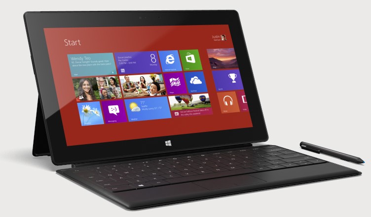
Today, we will be looking at the 32 Gb Surface running Windows 8 RT. The 16:9 1366×768 widescreen display is the very first thing you will notice with this tablet. At 10.6 inches vertically, interacting with MetroUI works on the horizontal very well. It will be great for those 16:9 movies and videos as well. They were even kind enough to provide a HD connection out to display the tablet on the TV.
The next thing you notice as you pull the tablet out of it’s packaging, is the weight of the device. Weighing in at 1.5 lbs, the VaporMg metal construction does make the device feel more like a premium product compared to some of the other Windows and Android tablets. Microsoft created the new metal technology called VaporMg (Vapor Mag) which is boasted to be as durable as aluminum while being lighter. They have also incorporated a retractable stand so that it is easy to prop up on a table or desk.
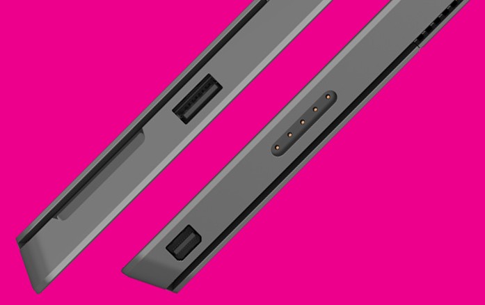
The magnetic charger is an idea that was clearly taken from Apple’s MagSafe chargers used on their MacBook line. You can not charge this device using a micro USB like androids and you would require a power converter or a car charger if they are manufactured. The idea is smart because it reduces the amount of wear and tear that a normal usb charging port sustains. The issue that I found here is that it seems like the magnet is not strong enough and pops off a little too easily while trying to use the device.
So how about the software itself? The way you interface with the Surface, and Windows 8 RT specifically, is pretty fluid once you understand how to use it. Having live tiles is pretty nice as well. Where Microsoft currently falls short is with application support. They provide a desktop-like environment that is fairly useless since you can not run legacy windows programs on the RT version of Windows 8. I would have preferred that Microsoft kept the desktop off their RT version of Windows because it is confusing and misleading. There is also no Java available at this time. Most of the time, this would not be an issue, but I do have some client’s that use Electronic Medical Record (EMR) software that requires it to run. This is best left to the Surface Pro which is rumored to be available this month.
The Surface comes with Office 2013, which is in a preview (test) state. Interestingly enough, Microsoft decided to continue to run this version of Office in the desktop mode instead of directly in MetroUI. Thinking that touch devices are the future, I thought that anything that they would do after the release of Windows 8, would interact more with MetroUI then the old desktop.
When it comes to MetroUI, the Microsoft Store is rather lack-luster in it’s current selection. Spoiled by the almost massive selection of applications on Apple and Android devices, Microsoft would need to expand theirs soon to. Once there are a good number of apps to choose from, I believe that this will make this device more suitable as an alternative to Android and Apple.
Space on this device, 32Gb, is a bit misleading. A good amount of this space is utilized for Windows 8 RT operating system files itself. This is somewhat to be expected but the remaining available memory seems rather small. Since there is not a huge selection of applications yet available for the RT platform, this is not yet a primary concern. It could potentially cause an issue down the road however.
Microsoft did give us a couple of ways to add memory to the device. One, the USB 2.0 port, can obviously be utilized for a flash drive or even and external hard drive. The second option, and a bit more unobtrusive, is the microSDXC slot that is hidden behind the kick stand.
With all of these specs, here is a breakdown of my Pros and Cons.
Pros:
- 16:9 Display. Great for streaming movies. Works great with MetroUI.
- VaporMg’s sturdy construction. Just feels right.
- microSDXC card slot. Easy semi-permenate memory expansion. Located behind the stand.
- USB 2.0 port. Allows file sharing (Only good for Office as far as I can tell at this point).
- HDI out. Awesome if you want to share an application on the big screen.
Cons:
- Built-In stand. Some may rather have that in a case.
- Magnetic charger pops off easily while the tablet is being used.
- Lack of application support for legacy programs from Windows 7 and earlier on the RT version.
- Memory size is misleading. Good portion used for the operating system.
Conclusion:
The Microsoft Surface is a fine example of physical design, but suffers from a lack of an application marketplace. It tries to bridge the gap between the laptop and the tablet, but the lack of legacy application support makes the Surface fall short of this goal.
The desktop “tease” that Windows 8 RT gives us is nothing more then that. Microsoft should have just did away with it for the RT tablets and focused on the MetroUI and Microsoft Store. Then the Surface RT would at least be more comparable to the Android and Apple tablets. Without the applications, there is not enough muscle to compete with Apple and Android.
I would be more interested in the Surface Pro since it will come with an i5 processor which will allow it run a full version of Windows 8 Pro, and thus, the legacy applications that we all need and love. Couple that with a hopefully more diverse selection of applications form the Microsoft Store, and I think the Surface Pro will be the next best thing since iPad. Businesses can then make the switch.


